Hello, I’m Dave.
I help companies build digital products and services by operating great design teams in a highly collabotive environment. I'm currently a Product Design Director at Thumbtack.
A few of my recent projects are below. If you’d like to know more about them or others, let’s have a chat. You can find me on LinkedIn.
Lyft Mgmt
2017–2022
Design Management
Teams
Rider Booking
Recommendations
Product Offerings
Rider Platform
Comms Platform
Web XP
Brand XP
Notable Product Launches
Passenger App Redesign
Multimodal Transportation App
Wait & Save
Preferred Rides
Priority Pickups
Rider Preferences
Shared Rides Relaunch
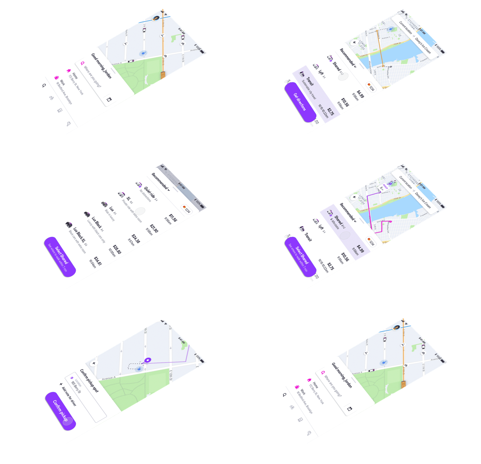
During my tenure, I managed 23 designers across 10 teams (5–10 designers at a given time) focused on launching, evolving, and optimizing the core booking flow, rideshare modes (eg. Preferred, Shared, Lux), app architecture, web tools, and branded experiences. I was responsible for the design strategy and experience on Lyft’s rideshare booking business, generating the bulk of Lyft’s $3.6B revenue from over 22M riders.
The multidisciplinary teams I helped lead redesigned Lyft's rider app twice, shifting from a car-only ridesharing service to a transportation platform supporting multiple lines of business. Designers worked on horizontal projects - shared UI components used by partner teams and iOS versioning improvements - as well as vertical product launches ranging from driver rating/tipping and scheduling rides to rideshare modes and upsells.
“Dave is a great coach and cheerleader. He represents a model of what an excellent manager should be like, and is someone who uplevels his own teams as well as his cross-functional partners.”
– Lyft Designer
As Lyft expanded its transportation offerings, I coached designers to author user-centered strategies on how Lyft could manage its portfolio of rideshare modes, shift trip planning beyond on-demand ordering, and evolve price versus time considerations in the booking flow. Designers would partner with cross-functional teammates to inform/align their work from a business and development perspective, co-author milestones and roadmaps, shepherd work with exectives and stakeholders, then execute.
The strategies and foundational UI patterns my teams developed are still in use today, notably: destination-first ordering, vertical mode selector, pickup/destination bar, pickup confirmation, and post-request panels. Throughout the highs and lows of the business and impact of COVID, I learned how to scale myself as a manager, drive design quality and development velocity, navigate change management, and how to maintain a culture of trust through empathetic support.

Twitter Mgmt
2015–2016
Design Management
Teams
Onboarding
People Discovery
Direct Messages
Profiles
Notable Product Launches
DM video capture & share
DM share a Tweet
DM read receipts & typing indicators
Connect Tab
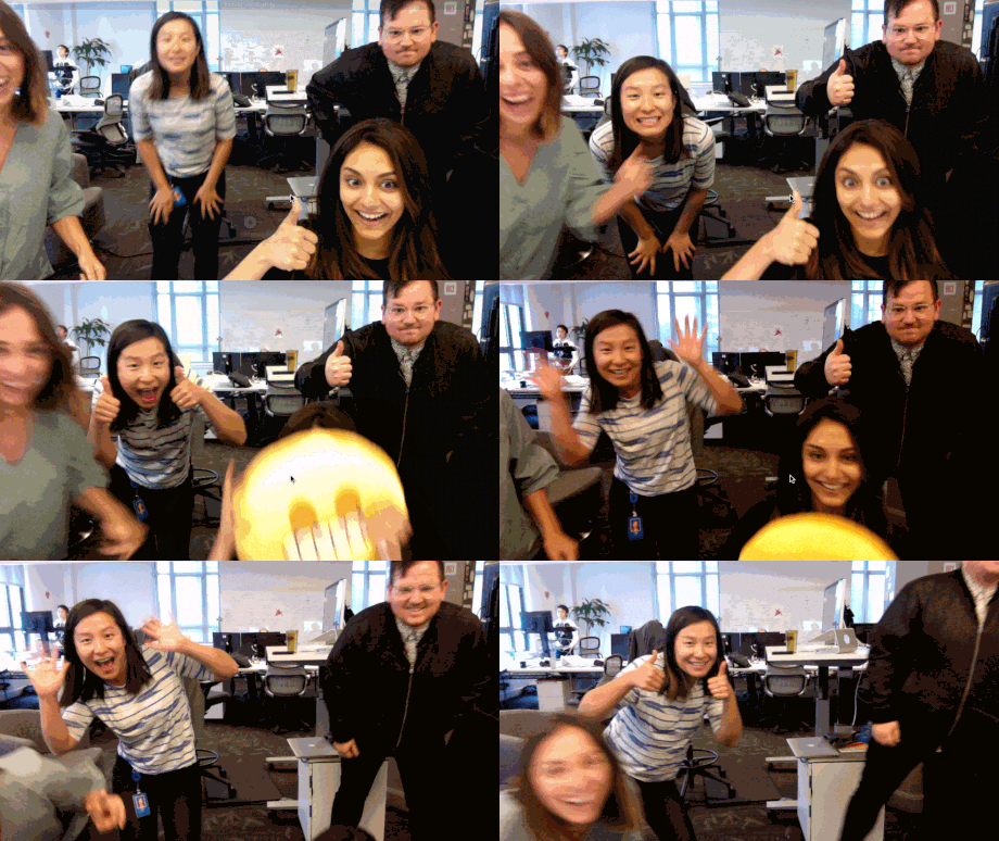
During my last year at Twitter, I had the opportunity to be a design manager and truly enjoyed the role. The designers (a few above) I worked with were talented individuals that held me accountable to make sure they got the most from their career at Twitter, and Twitter got the most from them. Product design at scale can be difficult—even more so in a public forum—and it was my job to make sure my design teams had the resources, information, influence, and partnerships to do great work.
I managed six designers across four teams: Onboarding, People Discovery, Direct Messages (DMs), Profiles, as well as a few separate initiatives. The projects we worked on ranged from new feature development and design debt maintenance to long-term strategy planning and iterative improvements.
Twitter Lite
2014–2015
Product Design
Product Management
Featured press
The Verge
Twitter Blog
Twitter Engineering
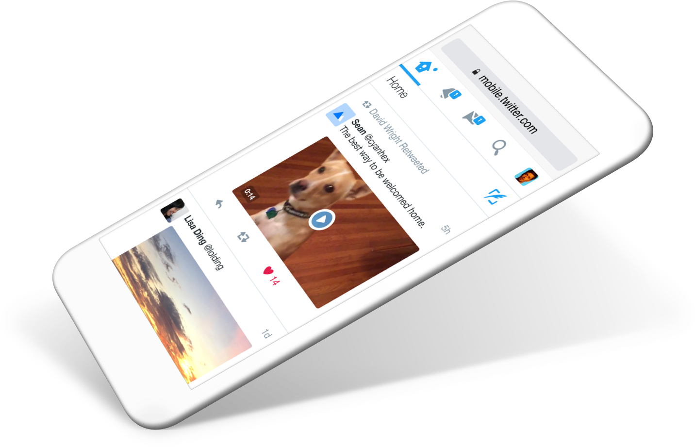
By 2014, years of native app prioritization had left Twitter’s mobile website in a poorly outdated version. With a small engineering team, we identified several opportunities: expand Twitter’s reach in emerging markets with a revamped mobile web experience, replace an old tech stack with a reliable and efficient architecture to deliver fast loading pages over low bandwidths, and completely redesign the UI with a componentized approach that allowed for future expansion. Additionally, we had the chance to build a case study for using design systems in our product design process.
Co-leading the design effort with Dave Wright, we aligned our design principles and priorities with engineering so we could work from a shared vocabulary: every byte counts, systematic design and layout, and iteration speed. Dave and I audited the entire site and feature sets, established a new grid and typography, designed responsive components across multiple viewports, and evangelized the project to design and feature teams throughout the process. Together, our goal was to design a clean, component-based foundation on which feature teams could quickly iterate and build on.
Concurrently, I also took on the role as product manager. My job was to: develop a project roadmap, experiment plan, and rollout strategy; identify and establish baseline metrics for success; coordinate with feature teams and assess their needs for mobile web; and define feature sets needed at launch and in subsequent versions.
I authored the global rollout plan to launch version 1.0 to 23 countries. The update became a new baseline for Twitter's mobile web product, and established foundational UI and IA for Twitter's progressive web app and desktop site. The project was a multi-year effort that required close partnerships between engineering, product, design, and a variety of stakeholders. As a result of our team’s work, we saw massive increases in engagement and monthly active users.
I’m grateful to have been part of such a large project and proud of the team’s accomplishments as they continue to rollout features and improvements.
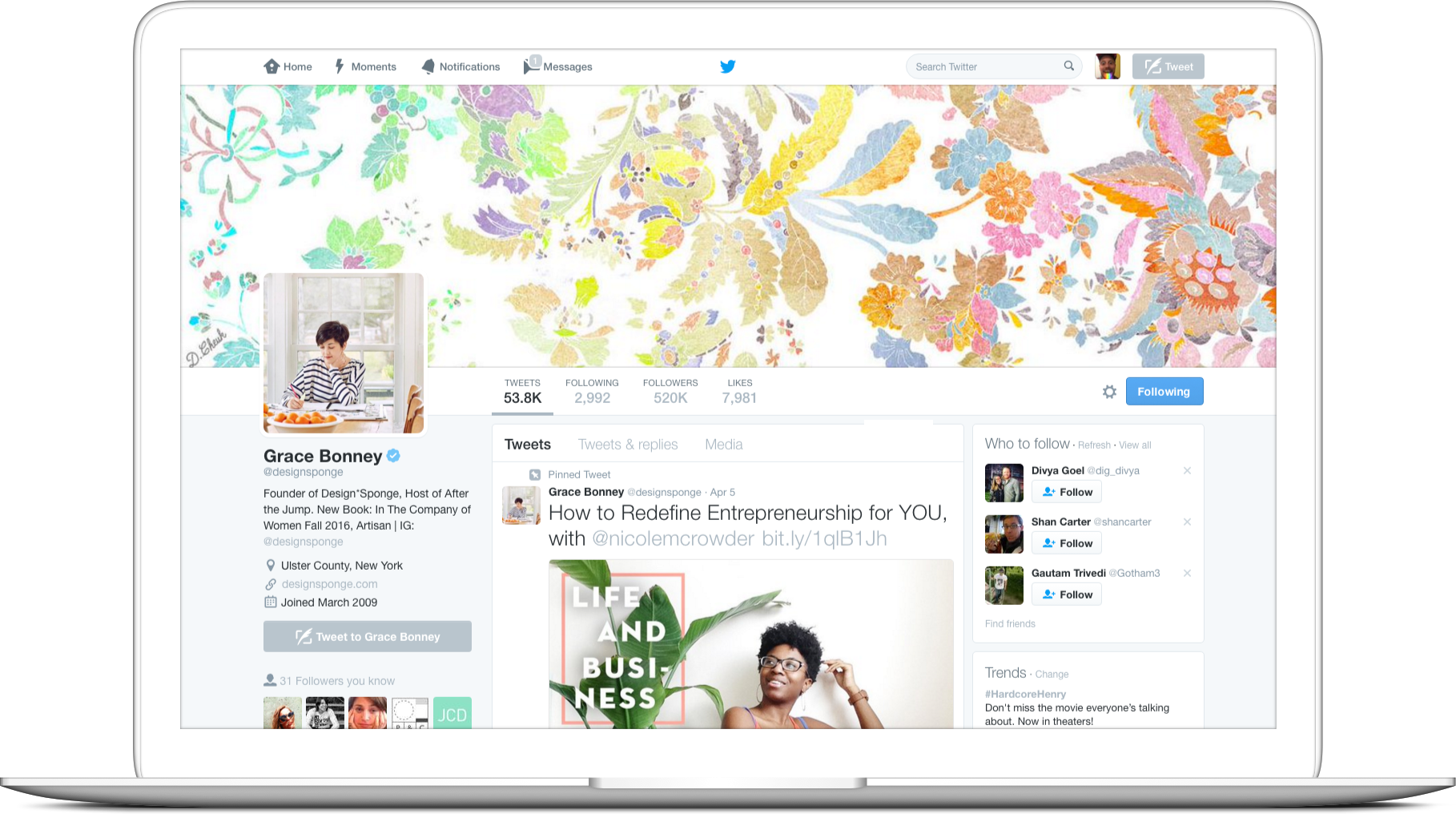
In a unique position to represent the service and its users to the general public, web profiles are the front door to Twitter, sitting between product awareness and product understanding. In 2013, profile pages were the most heavily trafficked logged-out property on Twitter.com and needed an upgrade from their legacy state.
As design lead on the project, I worked closely with our PM, Sachin Agarwal, to establish project guidelines: make Twitter easier to understand for new users, unlock Twitter as a destination for endless content discovery and consumption; and give profile owners new controls to express themselves no matter what level of expertise or activity. One of the many challenges we faced was to design a profile page template that served a diverse range of user types, from new users, celebrities, and government agencies to heavy users, non-profits, and news organizations.
“Profoundly game changing work. A+”
– Dick Costolo, Twitter CEO
I started with an audit of our current metrics, analyzed the competition, and catalogued different profile actions and content types. The team also began to test small, potential improvements that could be included in the larger redesign: inline profile editing, media forward Tweets, surface popular Tweets and user activity, and social proof. After early rounds of design, it became clear the current Twitter website—grid system, navigation, backgrounds—constrained the project and a broader redesign was needed.
After further iteration, we communicated our vision to executives in order to gain their support, secure engineering resources, and guide our teammates and stakeholders during the process. Once we had executive buy-in, we got to work to refining our feature set and release schedule, designing, prototyping, testing, evangelizing, iterating—wash, rinse, repeat. Ultimately, our team shipped over 30 updates and new features including: one-click Tweeting for new users, pinned Tweets, media-only Tweets timeline, dynamic Tweet sizing, filtered replies timeline, profile cards, cluster follow suggestions, and improved editing tools.
The redesign was ultimately shipped to 280M+ users and notably, resulted in an 83% increase in profile impressions and a 77% increase in profile scrolls.
I cut my product design teeth on this project in so many ways, learning—among other skills—the importance of internal communication, managing expectations, and roadmap coordination.